From the moment I saw examples for this project, I was excited. I loved the way these looked, from customs posted on the web, to examples that companies, like NECA, had produced. I also knew that this was going to be a challenging task.
I wasn't sure what figure(s) I would do, so when in doubt I usually do Cobra Commander based customs. I had perused Marvel's G.I. Joe run and had some ideas, but things shifted dramatically after talking with Matthew and he mentioned making customs based off of the first Nintendo G.I. Joe video game.
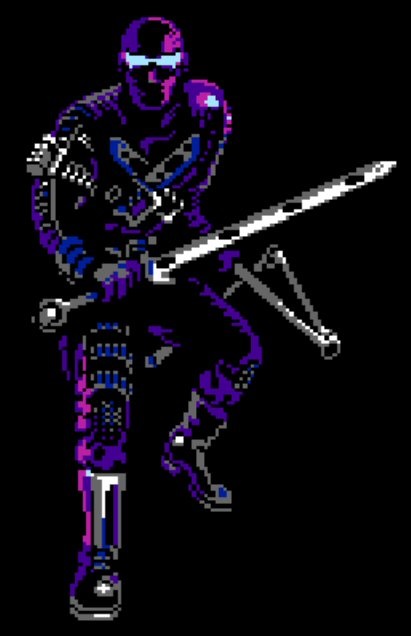
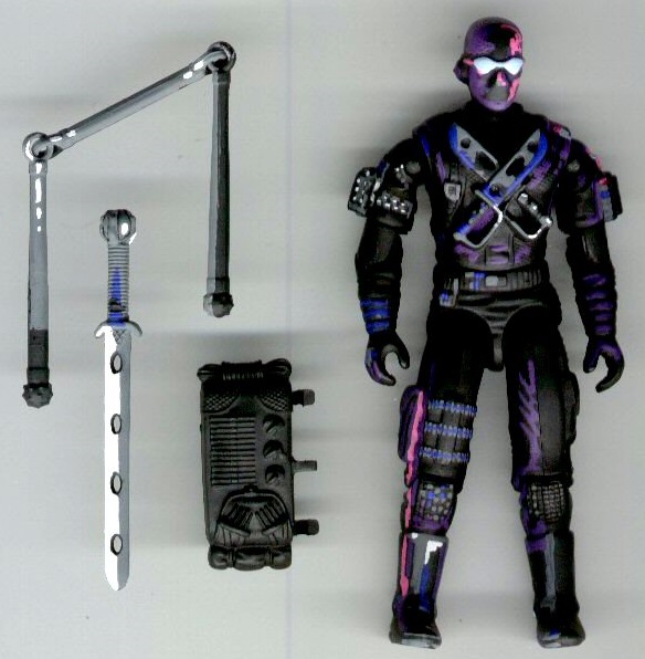
For Snake Eyes, I used the entire 1989 figure. I omitted his machine gun since in the game he "prefers his Jitsu of power," which requires no ammunition and is unlimited, and his blowgun for the same reason. Also, neither of these are shown on his character select screen either. I did choose to give him his backpack, and I had to created a peg because one had been broken off. I included this mainly for playability, even though it is not seen in the game.
The paint scheme, however, was the most difficult, the most important, and, amazingly enough, the most satisfying. After taking screen shots of the character select images, I made a swatch with the colors used. Next, for cohesiveness, Matthew and I chose paints that were closest to the game and the ones our characters shared. As you can see from the end results, we went completely different directions with our paint schemes.
I wanted to make these figures look as close as the character select screens as possible. All of the figures and accessories started with a base color of black, and I painted the highlights and lowlights. For the most part, if you cannot see it on the character select screen, then I left it painted black.
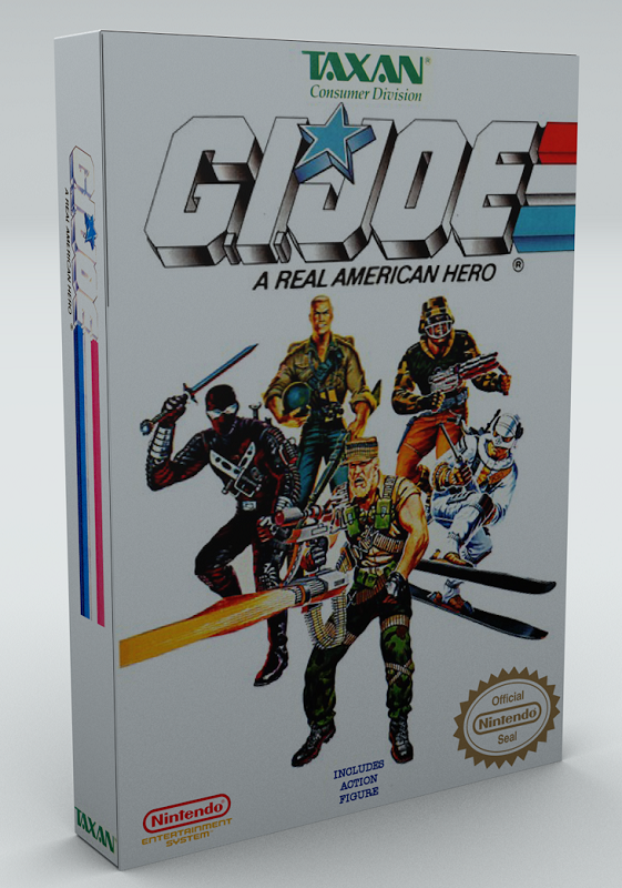
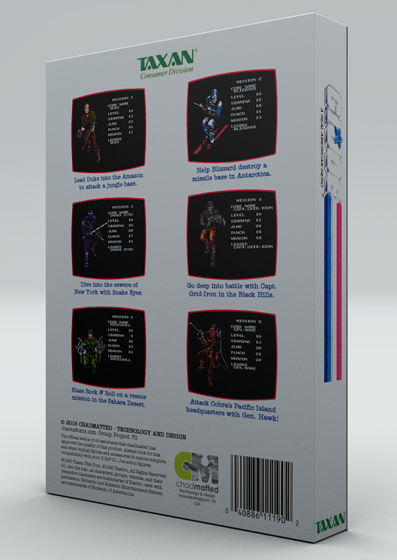
My first idea was to create packaging that reflected what NECA has done with all of their Nintendo based 7 inch figures. Matthew did a great job setting up this idea and creating the 3D renders. He gave me a template, and I modified/created the images for the packaging.
On the back of the box, I changed the in-game screens pictures to show the six playable characters from the game, including text that describes all six missions. I also changed/updated some of the text and logos as well. The inside of the box shows a shot of the in-game picture for each character, and there is an opening to show the actual figure in the packaging with their character descriptions.
The filecards were done as an afterthought. When Matthew and I realized that our customs were going in different directions, he suggested for his to have vintage style packaging. Since he did most of the legwork on the 3D packaging, I in turn created the cardbacks for his customs. Since I had already created his three filecards, I decided to make them for my characters as well. If you notice, the images are different from the character select ones, including different colors and poses. These images were shown when the game was paused and the player could chose a different character. The texts for these came from the Nintendo instruction manual. They are close but not exactly the same as the text used for these versions of the characters.
Though this was a challenging and time-consuming project, it has been extremely satisfying and will go down as one of my favorite group projects.


