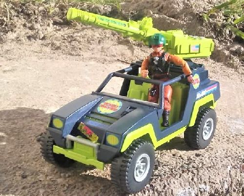
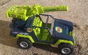
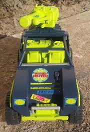
Sonic weapon, and mount from Fort America
All other parts from Vamp Mk1
Custom printed stickers
The Sonic Fighters _A.M.P. (Augmented Modulation Projector).
This one is P-U-R-E 1990's indulgence. Why fight the neon, it's there, embrace it.
Yes, I believe EVERYONE needs a Vamp. The Sonic Fighters are no exception.
All Sub-Groups have well defined rules. Colors and motifs that define them. The Sonic Fighters however, is perhaps the least defined Sub-Group in all of G.I. Joe. The only consistent rule is that they all have a sonic feature. There are only 2 vehicles associated with the line, and unlike every other Sub-Group, neither vehicle even has the teams logo on them let alone team colors. But they do have sonic weapons. Looking at the entire range of figures and vehicles, there is nothing other than the sonic features that unites this team. Heck even the Cobra side doesn't even have it's own name or logo for the set. What's up with that? So with no visual consistency, how do you make a vehicle that looks like it belongs to the team? Honestly, I don't know, but it freed me up to make whatever choices I wanted to make, and make what ever connections I wanted to make. And I think the results are totally radical dude!
First of all, The Sonic Fighters _A.M.P. needed a sonic weapon. That's the only standard on the team, so it had to be there. I like to use existing G.I. Joe parts much as possible to keep that Hasbro feel, and the ONLY sonic weapon that would remotely work was the main gun from Fort America. A tad large for a Vamp, I know, but this is the 1990's after all, Big and Loud was the name of the game. A cannon needs a mount, and fortunately Fort America was able to provide that as well. I carefully sawed off the gun mount as flat as I could and sanded it level. By pure chance it happens to fit on the back deck of a Vamp almost perfectly.
With that design problem out of the way, it was on to color. I needed it to somehow compliment the other 2 vehicles while at the same time not match them in any way. Fort America was sort of a dark blueish green, and rusty brown with bright yellow/orange accessories. While the Desert Apache is very light tan with black accents, and neon green missiles. So you have primary colors that don't match, and bright secondary colors that don't match. I knew I wanted the main body to be fairly dark so that whatever secondary colors, and stickers I chose would pop. Also, I wanted the color to be very different from any other previous iteration of the Vamp. So I looked at other vehicles from the early 1990's. Saw a lot of blue and bright green. That fit where I wanted to go with it. Already had a spray can of Wedgewood Blue I wanted to use for something else, and that complimented the blueish green of Fort America very nicely. Also had a can of Neon Green (I think it was called Key Lime) that was intended for another project, but didn't match the color I needed. It was at about this point that I realized that the Badger was almost exactly those colors inverted. Still needed an accent color. The weapon had light gray buttons that looked good with the neon green. Thought that might work, but I had another project that I wanted to use the same combination on, so I settled on a similar sliver.
As for the parts selection. The gun was obviously the main focus. That dictated the rest of the choices. Thinking like a toy designer with cost being a factor, I decided that the electronics of the gun meant that something had to be costed out. The only easy thing to remove on a Vamp are the roof and doors. Besides, it gets a little boring if every custom Vamp has doors. But I also wanted to really bring out that Neon Green interior. Can't really do that if you cover it with a roof. The exposure of the green interior really enhanced that 1990's feel.
On to the custom printed stickers. 2 things were happening near the end of the G.I. Joe line with stickers. They switched from vinyl to paper stickers, and the number of stickers, on average, went down drastically. Probably both due to cost. So that's what I wanted to do; make them paper, and keep them to a minimum. I digitally rebuilt the 1990's "3D" G.I. Joe logo from the logo's I used on other customs. More importantly I made a Sonic Fighters logo from scratch. Getting those colors close to correct was harder that I would have thought. The headlights were intentionally simple, and the tail lights intentionally absent. Lastly, I wanted something really 1990's for this project. Fort America, and Teenage Mutant Ninja Turtles provided the inspiration. The Fort has some unusual stickers for G.I. Joe. It has posters, and graffiti as part of it's "disguise." I wanted something like that for the A.M.P. And since Hasbro was kind of chasing the market at the time rather than leading it, and taking ninja ques from TMNT, I thought it might be inevitable that they might start taking more blatant design elements from their competitors. TMNT was well known for neon colored stickers with snarky comments on them. So I designed a pair of very '90's, sound based bumper stickers that could be placed anywhere on the vehicle. One reads "Rock On!" and the other is "Sound Off!"


