JoeCustoms.com
https://joecustoms.com/forums/

Superman Project (update 01/22)
https://joecustoms.com/forums/viewtopic.php?f=14&t=27453
Page 1 of 1

Author:  Robulus [ Wed Jan 19, 2011 3:47 am ]
Post subject:  Superman Project (update 01/22)

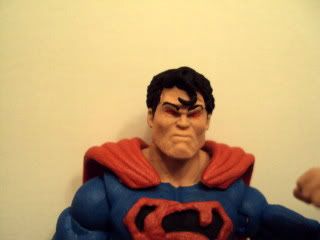
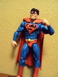
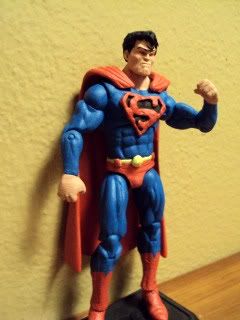
Thanks to everyone for all the help and suggestions on the Superman project. Its really helping alot and is much appreciated. I'm actually happy with how its looking...finally. I stuck with the 3d symbol, but cleaned it up a bit. I also went black instead of the classic yellow. It allowed me to get crisper edges and also fits with my angry Superman theme here as well (The head was good for that also). I'm really happy with how the Colossus head worked. I was worried it would be too large, but if anything it kinda balances out his build. I have a feeling I'm still going to dissapoint some with the sculpted symbol, but I think its coming along better now. I was very close to scrapping it and painting the symbol. Any thoughts? ****1/22/11 New pics of Superman "classic" WIP(5.0) below scroll down****
Image

Image

Image

Author:  Keenan [ Wed Jan 19, 2011 8:51 am ]
Post subject:  Re: Aquaman (3.0) and Superman (4.0 update)

The symbol looks loads better. And the newer head just makes him look bad-ass.
As for Aquaman 3.0- well, the hair and beard make him look like he's wearing a disguise. I think the issue may be that they're too tick and bushy.

Author:  night force cynic [ Wed Jan 19, 2011 10:16 am ]
Post subject:  Re: Aquaman (3.0) and Superman (4.0 update)

Aquaman looks great, I LOVE the hippie beard, amazing sculpt work. I hate the classic wardrobe for him really but I don't dislike here in the least, it works nicely for this custom.

I love the S shield on the boyscout 'cuz it looks like it pays tribute to the classic look but the brooding headsculpt and base parts are all totally modern and it all comes together to be a perfect Superman custom IMO. Definitely one of the nicest I've seen methinks.

Author:  drbindy [ Wed Jan 19, 2011 3:45 pm ]
Post subject:  Re: Aquaman (3.0) and Superman (4.0 update)

Supes is an improvement. I dig the head much more than before, though with the angry styling, I view it more as a variant Superman, and less of a default. But that's a simple matter of taste. The shield does look dramatically better, but I'm still pretty soundly in the decal or other printed style of logo camp. again, those are matters of taste, and I'm impressed by how hard you've worked to get it better. Also impressed by your willingness to hear and address feedback. Obviously you don't always have to agree with it, but just considering it is a good trait, imo.

Have to agree with John though on Aquaman.I think the level of detail you've put into the sculpt would work well on a larger scaled head, but here it kind of overwhelms the base. I'm far from a quality sculpter, but the one thing I'd recommend when sculpting is to create the definition with a fine pick or blade, rather than using separate rolled up pieces of material. At this scale, it' near impossible to individually sculpt the parts to make that look.

Author:  Iron Will [ Wed Jan 19, 2011 5:37 pm ]
Post subject:  Re: Aquaman (3.0) and Superman (4.0 update)

On Superman I would just thin and shrink the spitcurl and I think you'd have it. Aquaman I have to agree the hair and beard are way too thick.

Author:  unknownsoldier13 [ Fri Jan 21, 2011 7:04 pm ]
Post subject:  Re: Aquaman (3.0) and Superman (4.0 update)

I like where your going with your Superman . It reminds me of the Dark Knights returns version of the character. Especially with the 3d symbol. I have to agree on Aquaman, The Beard and hair almost look like a disguise. I would trim that up and add a black line above your eyes. It looks surprised as is. Both look great keep up the good work.

Author:  Robulus [ Sat Jan 22, 2011 2:25 pm ]
Post subject:  Superman (4.0 update)

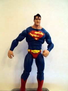
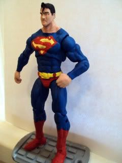
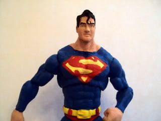
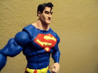
Thanks guys for the feedback. Since my 4.0 Superman project turned into more of a dark elseworlds Superman, I decided to make the antithesis....a classic good Superman. By doing this I was also able to incorporate more of the great suggestions and critiques offered as well. I went back and overhauled my scrapped 2.0 Supes adding some sculpting to the face and hair and repainting it entirely. I also decided to do the painted on logo as previously suggested, which also counterbalances the 3D emblem I gave my dark Superman. I shrunk down the hair curl this time around also, as suggested, and went back to the classic yellow emblem. I'm happy with both I just need a cape for good Kal. Thanks again guys. Any thoughts?

Image

Image

Image

Image

Author:  Iron Will [ Sat Jan 22, 2011 2:36 pm ]
Post subject:  Re: Superman Project (update 01/22)

Now this is my favorite version of Supes by you to date!! Cape should top it off!

Author:  Snikt [ Sat Jan 22, 2011 10:33 pm ]
Post subject:  Re: Superman Project (update 01/22)

You have me sold on this version, now he just needs his cape. (I admit the angry head is cool but this say Superman more to me)

Page 1 of 1 All times are UTC - 5 hours [ DST ]
Powered by phpBB © 2000, 2002, 2005, 2007 phpBB Group
http://www.phpbb.com/